.webp "How I Designed a 3D Advertisement for My Graduation Project? My Full Experience from Idea to Execution")
When the time for graduation projects approaches, most students start looking for a suitable idea that can be executed within the available time. As for me, I looked at it differently. I didn't want to complete a project that ends as soon as it's discussed; rather, I wanted to use this opportunity to create a work that represents the field I love working in, and that I can proudly add to my portfolio.
Before I started defining the project idea, I looked at the index of graduation projects completed in previous years at the university. I noticed that most of them focused on short films, TV reports, or academic studies. Then I became more convinced that I had to take a different path, not just to be different, but because 3D design and motion graphics were the fields where I invested most of my time during my study years, and this was a good opportunity to enrich the university's library with a work that addresses a new field that hadn't been touched upon before.
Although I started working on the project late, I decided to take on the challenge and execute a "full 3D advertisement for an economic product", starting from building the idea and visual identity, moving through modeling and animation, and all the way to rendering and final montage. It was the first time I handled all production stages entirely on my own, which made the experience full of challenges and lessons.
The road was not easy, as I faced many technical challenges, and in more than one stage, I had to rethink the workflow and look for solutions to problems I was dealing with for the first time. But with every obstacle, I learned something new, and with every stage, I felt that I wasn't just completing a graduation project, but building real experience that will accompany me in my professional career after university.
In this article, I will not only explain how I accomplished the project, but I will share the entire journey; starting from choosing the idea, through all the execution stages, all the way to the most important mistakes I made and the lessons I came away with after the project was finished.
The Visual Feeding Stage... How did the idea start?

Before starting the execution, I dedicated time to visual feeding (gathering references). I searched for ideas and similar advertising works to understand how products are presented in professional ads of this type. I browsed works on Behance and ArtStation, and watched dozens of ads on YouTube. My goal was never to copy them, but rather to try to understand the thought process behind each ad.
I focused on details that might seem simple, such as camera movement, lighting, color selection, shot sequencing, and the style of highlighting the product. All these elements gave me a clearer vision of what I wanted to achieve in my project.
After the research phase, the idea began to form in my mind. I decided not to use a real product available in the market due to time constraints, but rather to design my own product from scratch. This way, I would be responsible for all stages of work, from creating the visual identity to directing the final ad. Frankly, this made the project more challenging, but at the same time, it gave me greater freedom in design and creativity.
At that moment, I realized that the project wouldn't just be a software usage training, but a complete experience combining design, planning, directing, problem-solving, and decision-making at every stage of production.
After the project idea settled in my mind, I had to answer an important question: What is the product that I will design the ad for?
I could have chosen a well-known brand, but I felt that would restrict me. I wanted complete freedom in making all decisions, so I decided to design an entirely new product, as if I were working with a company that asked me to create a visual identity from scratch.
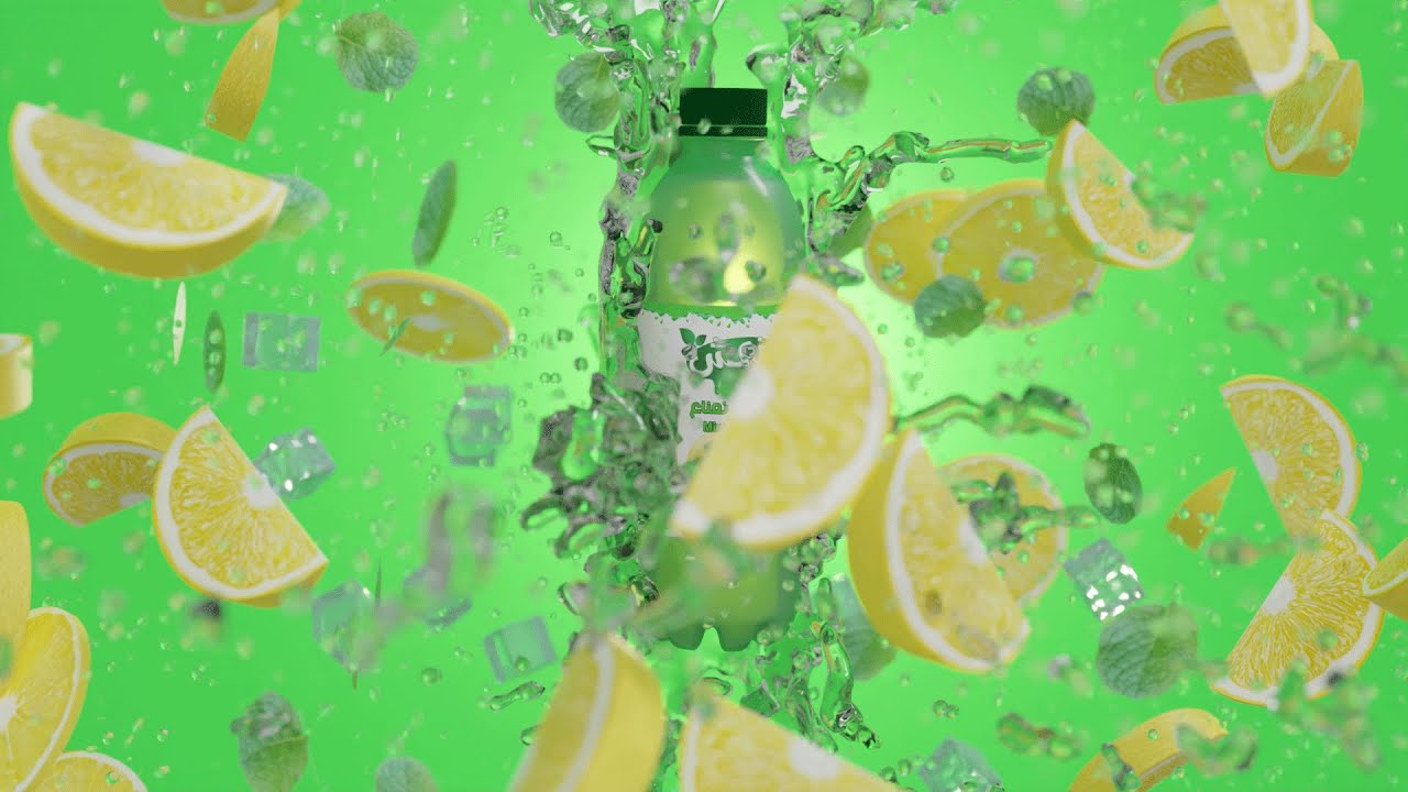
I chose to work on a lemon and mint-flavored drink, and this was the final decision, because this type of product gives a lot of room for creativity in terms of colors and visual elements. The idea of refreshment could also be highlighted through lighting, fluid dynamics, colors, and even the camera animation style.
After deciding on the product type, I started thinking about its identity. I chose the name "Moneesh" (Refreshing) for it because it's simple, easy to remember, and directly expresses the message I wanted the ad to convey to the viewer. I wasn't looking for a complex name, but rather a name that anyone would understand as soon as they read it.
.webp "The label image I designed for the ad") |
| The label image I designed for the ad |
After that, the visual identity design phase began. I chose appropriate colors and fonts, then designed the logo and the label that would wrap the bottle, so that all elements would reflect the product's identity as I envisioned it. Initially, I experimented with more than one color scheme until I reached the result I was looking for, because choosing colors wasn't just a matter of taste, but had a direct impact on the impression the product would leave.
I spent a long time experimenting with different ideas and designs until I reached a result that I felt expressed the product exactly the way I aspired to. This stage might have seemed simple compared to modeling or animation, but it was the foundation upon which the rest of the project was built.
Scriptwriting and Drawing the Storyboard:
After finishing the product's identity design, the picture became clearer in my mind, but I knew a good idea alone wasn't enough. I had to figure out how to turn it into a short ad that delivers the desired message in just a few seconds.
Therefore, I started by writing a simple script outlining the sequence of events, from the product's first appearance to the final shot. The goal wasn't to write a long text, but to define the main scenes and what I wanted the viewer to see at each stage of the ad.
Then I moved on to drawing the Storyboard, a step I considered a roadmap for the project. I sketched the key shots and defined camera angles, product movement, and the sequence of transitions between scenes. The drawings weren't professional, but they were enough to turn the ideas in my head into a clear plan I could execute later inside Blender.
One of the most beneficial things in this stage was discovering that some shots looked good on paper, but didn't serve the ad's sequence as I had imagined. So, I adjusted the order of some scenes before starting execution, which saved me a lot of time later.
When I finished the script and the storyboard, the project was no longer just an idea. I had a clear vision for almost every shot, which made moving to the modeling and execution phase much easier and more organized.
Modeling Stage:
After finishing the visual identity design and drawing the storyboard, I began the stage I was anticipating the most: modeling inside Blender. Here, the idea was no longer just sketches or diagrams, but gradually started turning into 3D elements that would appear in the final ad.
I started by designing the product bottle because it's the main element around which all shots revolve. I made sure to tweak its shape and dimensions before adding the label I had previously designed, because any mistake at this stage would clearly show in the close-up shots the ad relies on.
.webp "3D model of the bottle")
After that, I moved on to designing the elements that enhance the product's identity, such as lemon slices, mint leaves, the cap, and then the rest of the details that would appear around the bottle during animation. I didn't treat these elements as mere aesthetic details; I considered them part of the scene contributing to delivering the idea of refreshment that the ad is based on.
What I noticed while working is that modeling is a process that relies on experimentation more than I expected. Often, I would finish designing a specific element, then go back to modify it after placing it in the scene, because its appearance alongside other elements differed from how it looked on its own.
.webp "3D model of the bottle")
As the basic models were completed, I was able to see the ad taking shape in front of me for the first time. That's when I felt the planning stage was truly over, and the project had started taking its real form, paving the way for an equally important stage: adding materials and lighting that would give these models their final look.
Shading Stage:
I started working on materials (Shading), the stage where the models transitioned from simple geometric shapes to elements that looked closer to reality.
I relied on the PBR Materials system inside Blender, utilizing nodes to build materials and control their properties. My goal was for each material to have its appropriate physical properties, whether in terms of reflection, roughness, or transparency, so that it interacts with lighting convincingly.
.webp "Applying materials to the bottle in Blender")
I focused particularly on the plastic bottle material because it's the main element in the ad. It required a delicate balance between transparency and reflections so the liquid inside would show clearly, without losing the feel of being a real bottle. I also worked on the label material to make it look like part of the bottle and not just an image placed on top of it.
.webp "Applying materials to the lemon in Blender")
As for the other elements, such as lemon slices, mint leaves, and ice cubes, I tried giving each element properties matching its nature. The lemon needed a material showing the details of the peel and pulp, while for the ice, I relied on transparency and refraction to give it a more realistic look, keeping in mind how this would affect render times.
One of the things I also considered was striking a balance between material quality and scene performance. The higher the resolution and complexity of the materials, the higher the memory consumption and render time. Therefore, I was always looking for the best possible visual result without significantly impacting the project's performance.
Scene Creation and Lighting Stage:
The stage where I brought everything together inside the ad's scenes. This was the first time I saw the elements I had worked on separately come together in a single environment, which made me feel the project was really taking its true shape.
I divided the ad into several scenes, with each scene playing a role in building the idea and telling the story I wanted to present. I started with the lemon orchard scene, which represents the beginning of the product's journey, then moved to other scenes like the explosion of ingredients and the bottle shots, making sure the transition between them was natural and maintained the sequence of events.
.webp "Exterior scene")
In this stage, my role wasn't limited to placing elements in the scene. I was also thinking about each element's position within the camera frame to ensure a balanced visual composition. Sometimes I would spend a long time slightly shifting a lemon slice or a mint leaf just a few centimeters, because this simple adjustment made a huge difference in the final composition.
As for lighting, it varied from one scene to another. In the exterior shots, I relied heavily on HDRI maps because they gave me natural lighting and realistic reflections quickly, and helped me achieve the result I was looking for without having to set up a large number of light sources.
.webp "Interior scene")
However, in the interior shots, with the abundance of elements and simulations inside the scene, HDRI maps alone were no longer sufficient. So, I relied on traditional lighting inside Blender. I continuously adjusted the positions, intensities, and directions of the lights until I could highlight the product and show its details exactly the way I wanted, while maintaining a balanced lighting setup in the scene.
This stage taught me that an ad's success doesn't just depend on the quality of the models, but on how they are distributed within the scene, choosing the right camera angle, and the lighting that guides the viewer's eye towards the most important element. After all scenes were ready, I moved to the stage that would give them movement and rhythm: animating the elements and the camera.
Simulation Stage:
At first, I thought running a simulation would just be tweaking some settings; because I had previously simulated cloth and explained it in the tutorial How I made a flag wave in Blender. However, I quickly discovered that achieving a natural fluid simulation required a lot of experimentation. Every time I changed a small value, the result completely changed, forcing me to recalculate the simulation countless times.
The biggest problem I faced was simulating the water inside the bottle. Initially, the water didn't interact with the bottle properly. It would either clip through it or behave unrealistically, which led me to believe the issue lay in the fluid settings themselves. But after hours of experimenting, I finally discovered the real culprit was the bottle. Here is a video I recorded when I encountered the problem.
To solve this issue, I increased the Thickness of the bottle's wall, recalculated the Normals, and then adjusted the Rigid Body and Collision settings until the water interacted correctly with the container. That was one of the most satisfying moments, because I wasn't just looking for a ready-made solution, but I was trying to understand the root cause of the problem first.
The simulation wasn't just limited to water. I also used it with mint leaves, ice cubes, and water droplets so all elements would appear as part of a single scene interacting naturally. Each element required different settings, so I was constantly going back to tweak values and re-run the simulation until I reached the result I envisioned.
This stage taught me an important lesson: in 3D design, achieving the final result doesn't depend on memorizing settings, but on understanding the problem and being patient with experimentation until you find the right solution.
Animation Stage:
This was the stage I had been waiting for since the beginning of the project: animating the elements. Here, the goal was no longer just creating a beautiful scene, but bringing it to life and grabbing the viewer's attention from the very first second.
The ad started with lemons falling from the tree, then transitioning to refreshing water, followed by ice cubes and mint leaves scattering in a scene I wanted to reflect a sense of freshness and vitality.
After that, I moved on to animating the bottle itself, spinning it to show its design from multiple angles, then animating the cap before the water poured out of the bottle, leading up to the final shot where the bottles move together to conclude the ad.
These movements might look simple when watching the ad, but they took a long time to execute. The challenge wasn't just moving the elements, but making all movements feel connected, so the viewer feels that each shot leads naturally into the next.
I spent long hours in the Graph Editor tweaking animation curves, adjusting start and end speeds, and re-timing shots to achieve the exact feeling I was aiming for. I learned many things during this process that I hadn't known before, so a large part of this work relied on trial and error.
.webp "Bottle cap animation graph")
Looking at this project today, I notice many things I now execute with much greater mastery, thanks to the experience I gained during this journey. Some principles I apply today were unknown to me while making this ad. I've previously discussed this in my article "6 Things That Improved My Motion Graphics Work", where I share the most important lessons I learned after years of working, and how I now approach animation differently.
With this stage complete, all shots were nearly ready. All that was left was the final step of combining everything into a single video: Rendering and final export.
Rendering Stage:
After about two months of continuous work, I reached the stage I had been anticipating since the beginning of the project: Rendering. At this stage, most parts of the project were complete, and all that remained was transforming the scene from inside Blender into a video ready to be watched.
Initially, I didn't render the final scenes right away because that would have consumed a massive amount of time every time I discovered a minor mistake. Instead, I relied on Eevee at first, as it's much faster and allowed me to review camera movements, lighting, and simulations to ensure everything worked as it should.
Once I was satisfied with the shot, I would switch to Cycles. However, I didn't use the highest quality settings immediately. I would render with lower settings first to see the result and make sure there were no errors I had missed during the workflow. Only if the shot looked exactly as I wanted it, would I start the final high-quality render.
.webp "Rendering Stage")
This method saved me a lot of time. Instead of waiting hours for a shot to render only to discover a flaw that forced a complete re-render, I caught most issues in the early stages, then began the final render with the peace of mind that everything was ready.
Although the rendering process took a long time, it was one of the most enjoyable moments for me. As each shot finished, I felt the project that started as a simple idea on paper was nearing its final form, and that the effort I had poured in over the past two months was finally materializing on the screen.
Compositing and Color Correction Stage:
After finishing the rendering of all shots, the project wasn't quite done yet. True, the scenes were ready, but I knew the final result didn't stop at the rendering stage. There was another equally important stage: Compositing and Color Correction.
.webp "Compositing")
In this stage, I moved to After Effects, where I began assembling the shots and making adjustments that were difficult to execute during the render inside Blender. I focused on enhancing colors, adjusting contrast and lighting, so that all scenes looked consistent, as if they were filmed in the same environment as much as possible.
My goal was to make the ad's colors more vibrant, highlighting the yellow of the lemon slices and the green of the mint, while preserving the product's identity without overdoing the color grading. I tried multiple settings, comparing the before and after results until I achieved the look I felt served the ad best.

I also utilized this stage to add some final visual touches, such as sharpening the image and adding subtle effects that helped increase the scene's realism without drawing the viewer's attention directly to them.
I learned from this stage that rendering isn't the end of the work, but rather the beginning of a new phase. Often, simple tweaks during compositing were enough to make a noticeable difference in the final result without needing to re-render the entire scene. Because of this, compositing became a fundamental part of my workflow in most of the projects I completed later.
Montage and Final Assembly Stage:
The final stage of the project: Montage. This is where all the parts I had worked on over the past months finally came together into a single video.

I had already selected the appropriate music before reaching this point. However, the real challenge wasn't in choosing it, but in synchronizing the shots with it. I spent time tweaking the timing of transitions and camera movements to match the rhythm of the music, because I believed that picture and sound must work together, not separately.
Next, I recorded the voiceover for the ad. I won't expand on this step here, because I have previously explained in detail the method I use to record my voice and improve audio quality, and how I get the best possible quality. You can refer to those articles if you want to know the specifics.
Then I started adding sound effects that made the scenes more convincing—like the sound of water, the movement of elements, and other subtle noises that breathe life into the video even if the viewer doesn't consciously notice them. To me, these small details were among the most critical elements in making the ad look professional.
After reviewing the project multiple times and ensuring the synchronization between the visuals, music, voiceover, and sound effects, only the final step remained: exporting the final version. It was only then that I felt the project, which started as a simple idea, had become a complete ad that I could truly be proud of.
Final Result of the Project: